Happy day peeps,
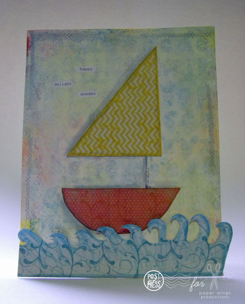
I tried my hand at a gift for a baby (probably boy, but perhaps not) that adds a little color and handmade charm to the nursery using the color combo from last week of yellow, aqua and coral. For more information and projects using this color combo check out this post HERE and HERE.
My background was inspired by Julie's baby card found HERE. I loved how she used all of her Whimsical Pattern Alphabet as a background and that is how I began as well...stamping the entire alphabet to make a fun pattern.
I then added watercolor markers, followed by Dylusions ink sprays and a Dylusions stencil and plenty of water. The colors were very vibrant and pretty, but I thought they were too intense for this project so I used a mixture of gesso and warm white paint to mute the colors. Of course this covered up the alphabet so I stamped it several times after the first time. Luckily the base of my project was a pretty heavy weight watercolor paper which held up to all the layers very well.
I cut out the little paper boat and waves from patterned paper (don't worry about it being perfect, there is something special when you can see that someone made something themselves) and then I stamped each piece with a matching ink color using a flourish from Flourish Fun 2 and edged each with a matching color of watercolor marker. These flourishes work for nearly anything and I could probably add a flourish to every project I made so I better watch myself!
My last bit of stamping was done sporadically around the top, right and left borders using the criss-cross border image from Details Framer using a gray ink so that it was somewhat subtle. The words I had at hand...I like to sometimes type up a variety of words or phrases and have them when I need a few words sprinkled about a project.
Popping this little project into a frame would make a sweet gift for a little sailor. You could easily change up the colors and patterns along with the image to suit your needs (for instance you could cut out a heart for a wedding gift...a house for a welcome home, hostess gift or housewarming gift).
Don't forget to check out the lovely card Julie made for a baby shower HERE.
Take flight,
Shay.
Showing posts with label color combo. Show all posts
Thursday, May 24, 2012
Friday, May 18, 2012
Color Combo Part II
Happy Friday peeps,
I know I am meeting this Friday with a great deal of relief. How about you? Are you too looking forward to the different pace of the weekend? Planning on doing some stamping?
Today I have the second part of the yellow, aqua and coral color combo. In this post are slightly larger projects than the cards from Wednesday.
Julie's project:
Julie made this timely (I could not resist that cheesy pun) art journal page using Flight Plan Mission 002 as a design guide. Julie first painted the pages with white paint and then she used watercolor crayons to create the gradient yellow and coral background. I love how she used Tim Holtz's tissue tape for the strips from the Flight Plan and that you can also see the color behind them. The frame was cut out using her Silhouette and she colored it in with a Distress Marker (barn door)--even though the color is a red I think it could read as a very deep, rich coral. Don't feel that the colors must match the color combo exactly...like the Flight Plan they are meant as a guide. Some reds and pinks will be reminiscent of coral for instance.
I am particularly taken with the punched circles that she stamped with various borders from Day Framer, Detail Framer, Life Framer and Snapshot Framer. The days of the week are from Snapshot Framer and the date are from the Life Framer.
How did she create those circles with perfectly coordinated colors of the stamped image and its background? Julie stamped each circle with one of the borders using Distress Inks in the following colors: tumbled glass, broken china, barn door, scattered straw. To color in the backgrounds she took the ink pad and pressed it into her craft sheet. She then sprayed or spritzed the ink she transferred onto her craft sheet with water (use a little water spray bottle) and used a paint brush to paint lighter shades of the color she stamped with onto the circles.
To add some aqua (or in this instance teal) to the bottom left hand portion of her page she placed a piece of patterned paper under the gold (yellow) and red (coral) chipboard letters.
To future compliment her theme of time she stamped the clock from Melange Women 2 (I think) down the left hand side of the page.
Shay's project:
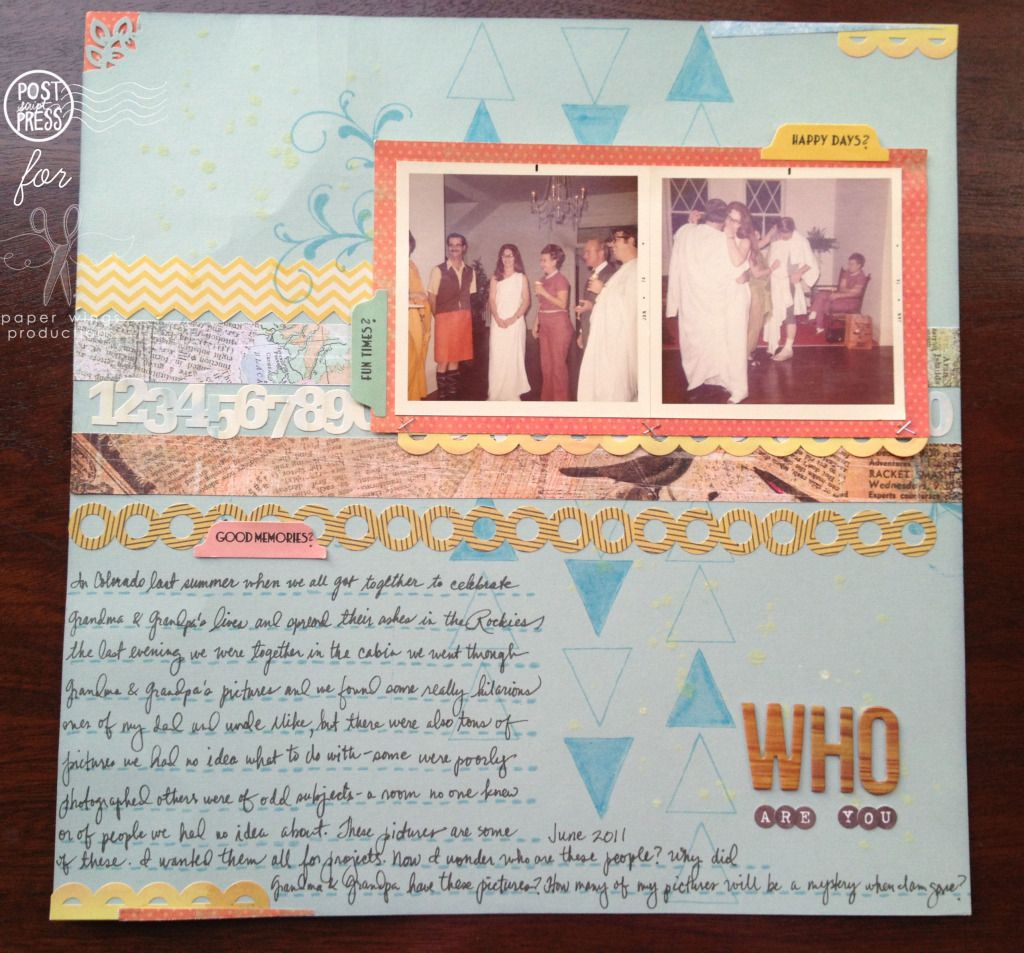
I decided to try my hand again at scrapbooking. I haven't done a 12x12 spread in ages, but with a color combo and using the Flight Plan Mission 002 I thought I would give it a try. The main point of this layout is the journaling because the pictures although really cool are a mystery. Another thing that helped me to tackle something I was pretty unfamiliar with was a scrapbook kit from Studio Calico (Glee Club from September 2011 which had the right colors and elements I really liked). I think it is always important to realize that you need not do it all. There are all sorts of ways to help you to create like sketches (like our Flight Plans), color challenges (like our color combo) and/or ready made kits. I also added a sticker sheet from October Afternoon which were in the right colors to pile of supplies to use along with some cream Mister Huey's (reads as a pale yellow color) which I used in the upper left hand side and lower right hand side.
In my scrapbook layout I think of stamping as the foundation. I created lines of triangles that remind me of arrows using the large pennant from Happy Day to act as the strips from Flight Plan Mission 002, but also for movement and to direct the eye to the pictures. I colored in a few odd triangles with an aqua colored marker. I didn't realize until later that the triangles mimic the diamond pattern of the window in the right hand picture. Happy accidents which no one but you has to know was unintentional...tell people you meant to do it! I added the flourishes from Flourish Fun 1 under the upper left hand corner and lower right hand corner of the photo block for some interest and more of an organic feel after so many more angular elements. All of my journaling was written on journal lines created from one of the border stamps from Day Framer...this border is perfect for journaling lines as you can stamp it over and over to make the line as long as you need it.
You probably noticed that my yellows, aquas and corals on this layout are a bit dusty or aged which is perfect for the older pictures whereas Julie's colors are more saturated and brighter reflecting a happy feeling. You can always use variations on the colors to reflect your story or project.
I hope you have the chance to play and experiment with something new or unfamiliar this weekend perhaps trying a new product, some stamps that you have been meaning to ink up, a different color combination than usual or a new technique. We would love to see what you do! Share with us on this post, our flickr group, Pinterest, Instagram (our user name is: paperwingsproductions), Twitter or Facebook!
Come back next week for some more Paper Wings Productions projects.
Take flight,
Shay.
I know I am meeting this Friday with a great deal of relief. How about you? Are you too looking forward to the different pace of the weekend? Planning on doing some stamping?
Today I have the second part of the yellow, aqua and coral color combo. In this post are slightly larger projects than the cards from Wednesday.
Julie's project:
Julie made this timely (I could not resist that cheesy pun) art journal page using Flight Plan Mission 002 as a design guide. Julie first painted the pages with white paint and then she used watercolor crayons to create the gradient yellow and coral background. I love how she used Tim Holtz's tissue tape for the strips from the Flight Plan and that you can also see the color behind them. The frame was cut out using her Silhouette and she colored it in with a Distress Marker (barn door)--even though the color is a red I think it could read as a very deep, rich coral. Don't feel that the colors must match the color combo exactly...like the Flight Plan they are meant as a guide. Some reds and pinks will be reminiscent of coral for instance.
I am particularly taken with the punched circles that she stamped with various borders from Day Framer, Detail Framer, Life Framer and Snapshot Framer. The days of the week are from Snapshot Framer and the date are from the Life Framer.
How did she create those circles with perfectly coordinated colors of the stamped image and its background? Julie stamped each circle with one of the borders using Distress Inks in the following colors: tumbled glass, broken china, barn door, scattered straw. To color in the backgrounds she took the ink pad and pressed it into her craft sheet. She then sprayed or spritzed the ink she transferred onto her craft sheet with water (use a little water spray bottle) and used a paint brush to paint lighter shades of the color she stamped with onto the circles.
To add some aqua (or in this instance teal) to the bottom left hand portion of her page she placed a piece of patterned paper under the gold (yellow) and red (coral) chipboard letters.
To future compliment her theme of time she stamped the clock from Melange Women 2 (I think) down the left hand side of the page.
Shay's project:
I decided to try my hand again at scrapbooking. I haven't done a 12x12 spread in ages, but with a color combo and using the Flight Plan Mission 002 I thought I would give it a try. The main point of this layout is the journaling because the pictures although really cool are a mystery. Another thing that helped me to tackle something I was pretty unfamiliar with was a scrapbook kit from Studio Calico (Glee Club from September 2011 which had the right colors and elements I really liked). I think it is always important to realize that you need not do it all. There are all sorts of ways to help you to create like sketches (like our Flight Plans), color challenges (like our color combo) and/or ready made kits. I also added a sticker sheet from October Afternoon which were in the right colors to pile of supplies to use along with some cream Mister Huey's (reads as a pale yellow color) which I used in the upper left hand side and lower right hand side.
In my scrapbook layout I think of stamping as the foundation. I created lines of triangles that remind me of arrows using the large pennant from Happy Day to act as the strips from Flight Plan Mission 002, but also for movement and to direct the eye to the pictures. I colored in a few odd triangles with an aqua colored marker. I didn't realize until later that the triangles mimic the diamond pattern of the window in the right hand picture. Happy accidents which no one but you has to know was unintentional...tell people you meant to do it! I added the flourishes from Flourish Fun 1 under the upper left hand corner and lower right hand corner of the photo block for some interest and more of an organic feel after so many more angular elements. All of my journaling was written on journal lines created from one of the border stamps from Day Framer...this border is perfect for journaling lines as you can stamp it over and over to make the line as long as you need it.
You probably noticed that my yellows, aquas and corals on this layout are a bit dusty or aged which is perfect for the older pictures whereas Julie's colors are more saturated and brighter reflecting a happy feeling. You can always use variations on the colors to reflect your story or project.
I hope you have the chance to play and experiment with something new or unfamiliar this weekend perhaps trying a new product, some stamps that you have been meaning to ink up, a different color combination than usual or a new technique. We would love to see what you do! Share with us on this post, our flickr group, Pinterest, Instagram (our user name is: paperwingsproductions), Twitter or Facebook!
Come back next week for some more Paper Wings Productions projects.
Take flight,
Shay.
Wednesday, May 16, 2012
Color Combo, Part I
Hello there peeps,
This week Julie and I bring you a few projects using the same summery color combo. Today are a couple of cards using yellow, aqua and coral based upon Flight Plan Mission 002.
Julie's card:
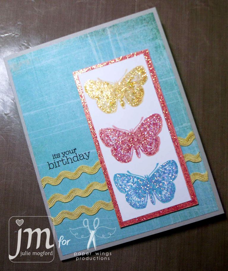
Julie made this pretty birthday card using the butterfly image from Carrie's Butterfly Panel. Did you notice how cleverly she used the yellow ric-rac as the strips in Flight Plan Mission 002? By stamping the single butterfly image three times in the three colors it makes a bigger impact further heightened by the use of coordinating colors of stickles. The birthday sentiment is a rub-on from her stash. Julie balances all the colors by using them each in the butterfly panel and then again in the rest of card. The white panel is framed by a shimmery rectangle of coral while the ric-rac is yellow and the main background is aqua.
Shay's card:
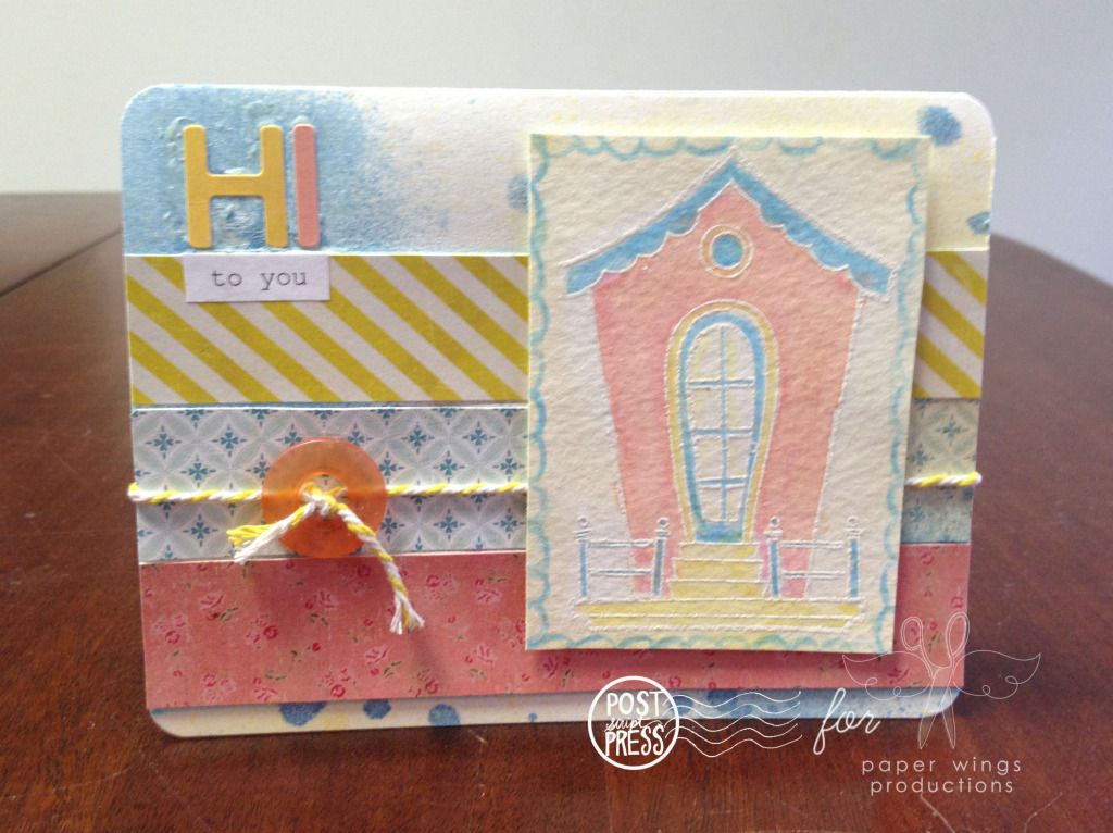
My any occasion card is a bit more
We would love to see what you create with this bright and happy color combo. Feel free to share on flickr, Pinterest, Facebook and/or here on this post.
See you again Friday with some more yellow, aqua and coral creations.
Take flight,
Shay.
Subscribe to:
Posts (Atom)